Fast checkout with Click to Pay
Situation
Our client was preparing for a major promotional campaign launch in August 2023. To support this launch, they aimed to enhance their checkout experience by integrating Click to Pay—a new, streamlined online payment method introduced by major card schemes, including VISA. The integration posed several challenges, including strict deadlines, evolving specifications, and a need for constant coordination between the Client and VISA.
Task
Our main objective was to incorporate Click to Pay on the Client’s payment page in time for the August campaign. We needed to balance the requirements of both VISA and the Client, ensuring a seamless, user-friendly experience on a tight timeline. This meant frequent adjustments to meet evolving design and technical standards from VISA, while keeping the Client’s promotional goals in mind.
Actions
To tackle the project challenges, I took the following key actions:
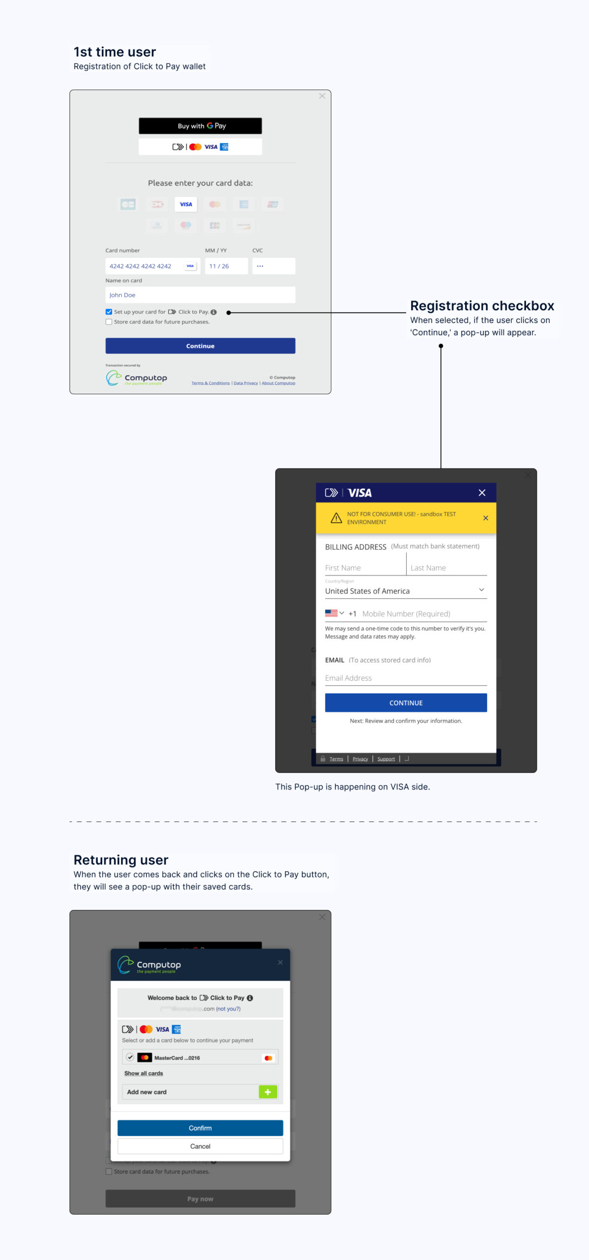
- Versioning for Familiarity: Given the limited time for user testing, I proposed a design flow similar to PayPal’s, making it intuitive for users already familiar with that process. This approach allowed us to create a straightforward experience that we could iterate quickly.
- Prototyping and Client Collaboration: I developed high-fidelity prototypes for each version of the Click to Pay flow, allowing Client’s design team to visualize and provide feedback on the nearly-final product. This ensured clear communication and alignment with client expectations at every step.
- Stakeholder Coordination and Flexibility: I led regular feedback sessions between Client, VISA, and our internal team, adapting the UX flows based on VISA’s evolving specifications. This included adjusting layouts, interactions, and UX flows to maintain compatibility with both VISA’s standards and the client’s needs.
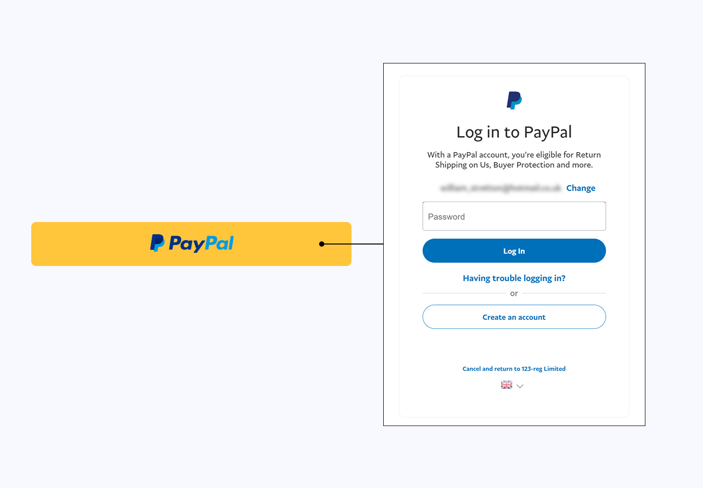
Versioning for Familiarity
With the launch deadline quickly approaching, we realized there wouldn’t be enough time for extensive user testing. Given the importance of usability in a payment flow, I took a strategic approach by designing the Click to Pay user journey to mirror an established, familiar payment method—PayPal. By following a flow similar to PayPal’s, I aimed to leverage users’ existing knowledge, thus minimizing the learning curve and reducing potential friction points for the Client’s customers.
- Rationale: By aligning the flow to something familiar, we could rely on users’ existing mental models of how similar payment methods work, reducing the risk of confusion.
- Outcome: This approach allowed us to create a more intuitive user experience quickly, even in the absence of external user testing. It also helped expedite feedback from the Client, as they could immediately see and understand how the flow would function.
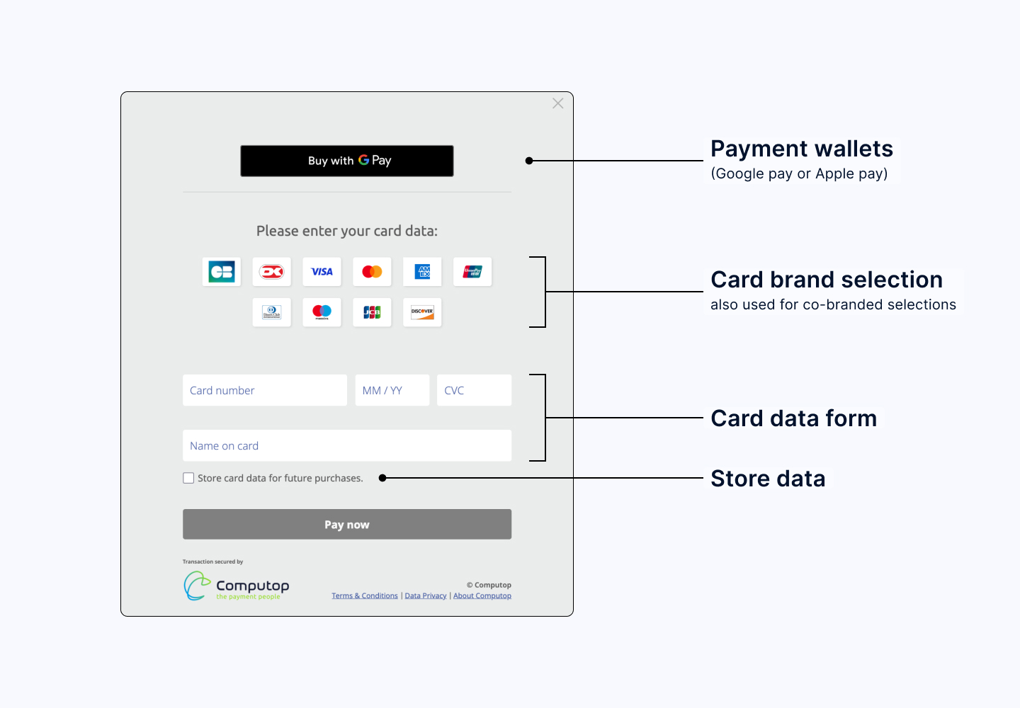
Prototyping and Client Collaboration
To ensure the Client’s design team had full visibility into how the final product would look and feel, I developed high-fidelity prototypes for each version of the Click to Pay flow. This wasn’t just about basic wireframes; I created interactive prototypes that closely resembled the end product, simulating the full Click to Pay experience.
- Process: For every iteration, I presented a clickable, high-fidelity prototype to the Client’s design and product teams. This allowed us to gather rapid feedback and identify any issues before development, ensuring we stayed aligned with the Client’s expectations.
- Benefit: High-fidelity prototypes helped the Client’s team to visualize the design accurately and make informed decisions quickly. This process also saved time by reducing the back-and-forth, as the Client could see exactly how the final product would function without ambiguity.
Stakeholder Coordination and Flexibility
A key challenge was managing the constant feedback loop between our team, VISA, and the Client. VISA’s Click to Pay specifications were evolving alongside our project, requiring our team to adapt quickly to new standards and UX guidelines. I led regular cross-functional meetings to keep all parties aligned and ensure a transparent, agile process.
- Approach: I coordinated weekly meetings with VISA’s design and development teams to stay updated on any changes to the Click to Pay requirements. Simultaneously, I worked closely with the Client’s product and design teams to communicate these updates and make necessary adjustments. This included modifying layouts, interaction flows, and specific UI elements based on VISA’s evolving guidelines, while ensuring the Client’s design preferences were respected.
- Outcome: By fostering strong communication channels and adapting our approach in real-time, we were able to handle new requirements from VISA without disrupting the project timeline. This flexibility was essential in meeting the Client’s needs while ensuring compliance with VISA’s standards.
Result
Through a combination of strategic decision-making, proactive communication, and flexible adaptation, we successfully launched Click to Pay on the client’s platform in time for the August 2023 campaign. The final product delivered an intuitive and secure payment experience that aligned with both the Client’s and VISA’s expectations, supporting the client’s promotional goals and enhancing the user experience on their card payment page.